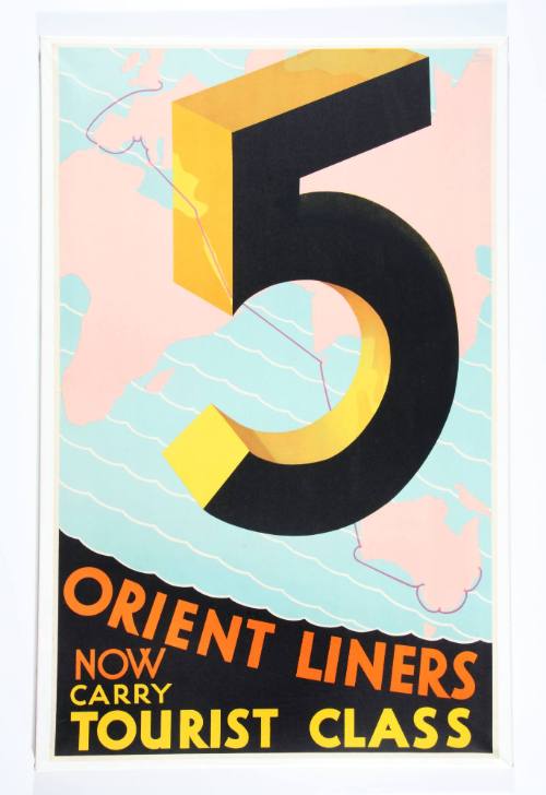
5 Orient Liners Now Carry Tourist Class
Date1929-1933
Object number00008657
NamePoster
MediumColour lithograph on paper
DimensionsOverall: 1275 x 925 mm
ClassificationsPosters and postcards
Credit LineANMM Collection
DescriptionThis poster promoting the tourist class services of the Orient Line's five 20,000 tonne vessels was designed by Frank Carter in the early 1930s. The abstract design and absence of a ship portrait in the poster is typical of the Modernist style of promotional material commissioned by the Orient Line in the 1930s. Embracing this Modernist aesthetic in both its ship interiors and branding, the company commissioned artists to produce bold posters that reflected this new design philosophy.HistoryDuring World War I most of the Orient Line ships were requisitioned as either armed merchant cruisers or troopships. Four ships were lost during the conflict. In the 1920s the company sought to replenish their tonnage and commissioned the construction of five sleek new turbine-driven ships, completed between 1924 and 1929, named ORAMA, ORONSAY, OTRANTO, ORFORD and ORONTES. The magnificent 20,000 tonners were designed to carry over 1,200 migrants in modest third class accommodation and almost 600 first class passengers in opulent surroundings.
In the early 1930s the Orient Line experienced changing conditions on the Australian route. Emigration dropped due to the Depression and developing tastes meant that passengers who could not afford the first class fare were no longer satisfied with the stark conditions of third class. The company recognised the lucrative market in business and economy passengers, where the quality of berths was not as important as budget and quality of service. By the mid-1930s the third class capacity on the 20,000 tonners was reduced and renamed tourist class.
SignificanceThe poster is a rare example of a design produced by leading British poster artist Frank Carter. The image is representative of a new focus on the abstract presentation of the company name and use of block colour, rather than information about the facilities offered to ticket classes.

